by iamrolanddiaz | Jan 4, 2026 | About Us
We designed this project to balance aesthetics and usability, ensuring the final output feels intuitive, professional, and purpose-driven. Every element was crafted to support both user engagement and long-term scalability.
Details
Jan 14, 2017
Elegant Themes
Categories
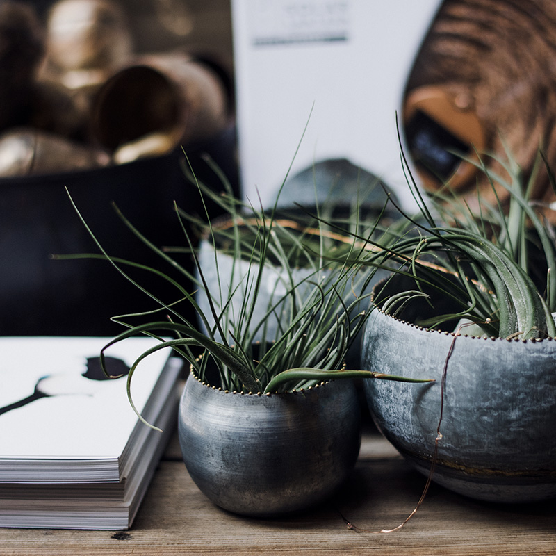
Web Design
Branding
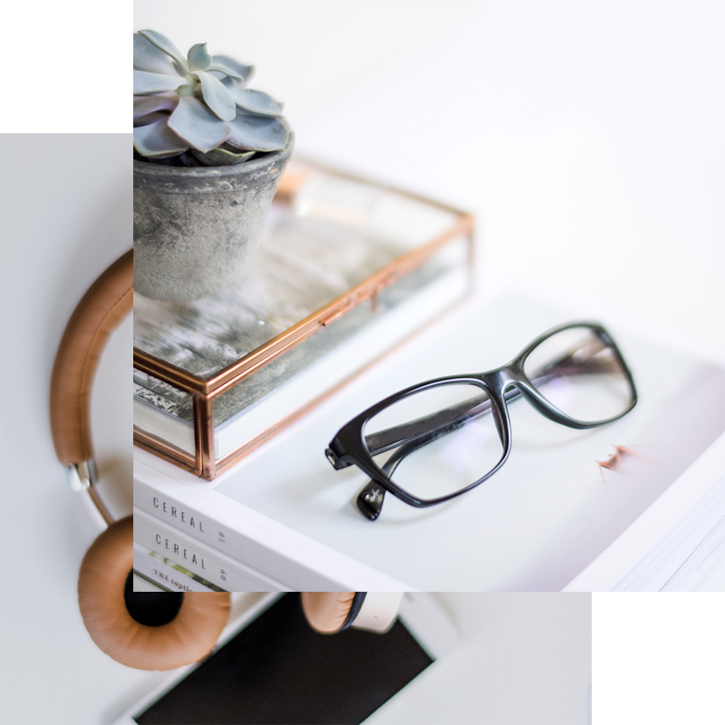
This project focused on delivering a clean and adaptable design system that works seamlessly across devices. From layout structure to color usage, each decision was made to enhance clarity, usability, and brand consistency.
The result is a polished interface that supports both functionality and visual storytelling.
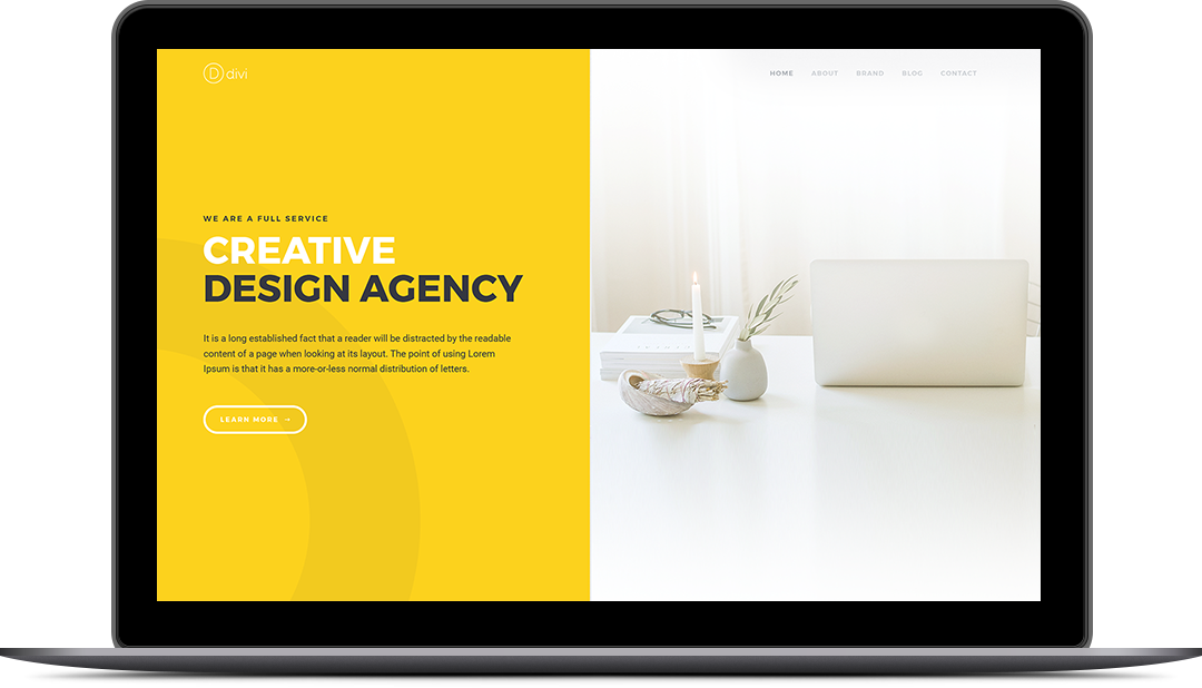
This section highlights how the design translates into a real-world digital experience. The layout emphasizes balance, white space, and hierarchy — ensuring content remains readable, engaging, and visually appealing.
Our goal was to create a design that feels modern today and remains relevant as the brand evolves.
Explore more projects that reflect our approach to branding, design, and digital execution.

by iamrolanddiaz | Jan 4, 2026 | About Us
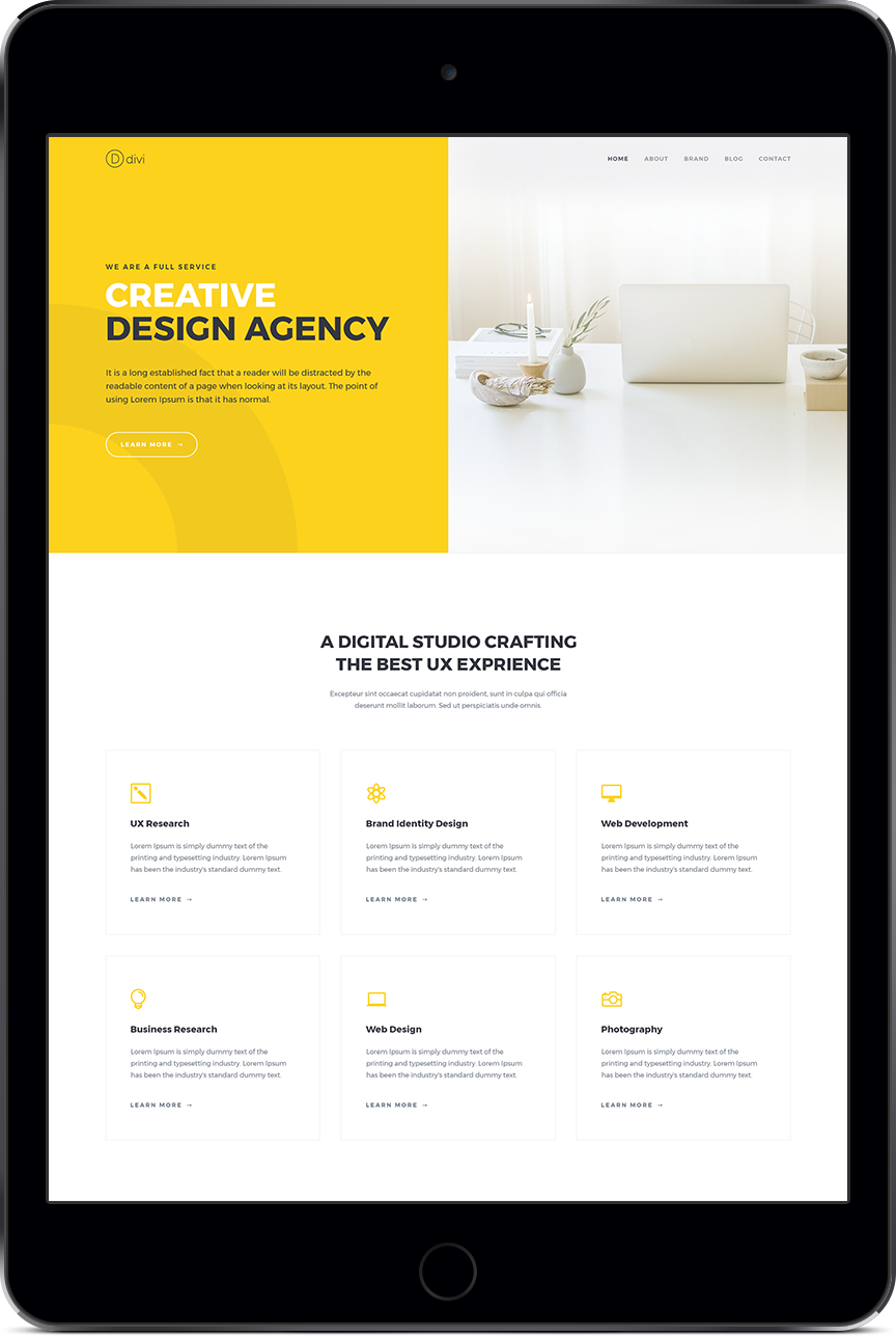
This project focused on designing a clean, modern digital experience that balances aesthetics with usability. Our goal was to create a product interface that feels intuitive, visually engaging, and aligned with the brand’s identity — while delivering real value to users.
We approached this project with a user-first mindset, carefully planning each element to support clarity, functionality, and performance. From layout structure to visual hierarchy, every detail was designed to guide users naturally through the experience.
The final result is a polished digital product that reflects thoughtful design, consistent branding, and practical execution across devices.
PROJECT DETAILS
This project involved research, design exploration, and refinement to ensure the final output met both user needs and business objectives.
We focused on clean layouts, balanced spacing, and a modern color system to create a visually cohesive experience. Accessibility, responsiveness, and usability were key considerations throughout the process.
DESIGN APPROACH
Our design process began with understanding the core goals of the project. We translated these insights into wireframes and visual concepts, refining the design through iteration and feedback.
By combining simplicity with purpose, we delivered a product design that feels both functional and refined — supporting long-term use and future scalability.
by iamrolanddiaz | Jan 4, 2026 | About Us
This project focused on clarity, usability, and performance — ensuring users can browse, discover, and purchase products effortlessly.
Team
John Doe
Jan Smith
David Andrews
Categories
Web Design
Branding
We began by understanding the brand’s audience, goals, and competitors. This phase helped us identify key usability challenges and opportunities for improvement within the shopping experience.
We partnered with a growing online retail brand to design a modern, conversion-focused digital store that delivers a seamless shopping experience across devices.
Research & Discovery
We began by understanding the brand’s audience, goals, and competitors. This phase helped us identify key usability challenges and opportunities for improvement within the shopping experience.
Design & Prototyping
Using insights from research, we developed wireframes and visual concepts focused on clean layouts, strong product presentation, and intuitive navigation.
Development & Testing
The design was translated into a responsive, high-performance interface, tested across devices to ensure consistency, speed, and usability.
RESPONSIVE EXPERIENCE
The store was designed to perform flawlessly across desktop, tablet, and mobile devices. Content hierarchy, spacing, and interactions were carefully adjusted to ensure usability remains consistent regardless of screen size.
The online store was designed to support both aesthetics and functionality. Key features include:
-
Clean and modern product layouts
-
Optimized product pages for conversions
-
Intuitive navigation and filtering
-
Mobile-first responsive design
-
Consistent branding across all pages
Each feature was built to enhance the user journey and reduce friction during checkout.
A STORY IN RESEARCH
Design decisions were driven by data and user behavior. By analyzing browsing patterns and testing early concepts, we refined layouts and interactions to better support product discovery and purchasing decisions.
This research-first approach ensured the final design aligned with both user needs and business objectives.
THE NUMBERS
-
11 Completed Pages
-
3 Design Revisions
-
0 Missed Deadlines
-
51 Design Elements
These results reflect a streamlined process and efficient collaboration.
OTHER RECENT WORKS
Explore more projects that showcase our approach to digital design, branding, and user experience.
View More Projects
The store was designed to perform flawlessly across desktop, tablet, and mobile devices. Content hierarchy, spacing, and interactions were carefully adjusted to ensure usability remains consistent regardless of screen size.
Design decisions were driven by data and user behavior. By analyzing browsing patterns and testing early concepts, we refined layouts and interactions to better support product discovery and purchasing decisions.
This research-first approach ensured the final design aligned with both user needs and business objectives.
-
11 Completed Pages
-
3 Design Revisions
-
0 Missed Deadlines
-
51 Design Elements
These results reflect a streamlined process and efficient collaboration.
-
Conversion Rate – 90%
-
Return Users – 77%
-
Social Following – 85%
Explore more projects that showcase our approach to digital design, branding, and user experience.
Let’s Start Something new
Say Hello!
Have a project in mind? Let’s collaborate and turn your ideas into a meaningful digital experience.